
Sweet Dreams
The intersection of imagination and appetite
Sweet Dreams was born in New Jersey from a simple yet powerful idea: candy should spark excitement without emptying pockets. At the time, the candy aisle had become crowded with copy-paste packaging and relentless price battles. Amid all this noise, brands had lost sight of the very audience candy was made for: kids. Mid-tier confectionery had drifted into a bland sea of sameness, stripped of the childlike thrill and spontaneous delight that make sweet treats irresistible in the first place.
Grate stepped in to make sure Sweet Dreams could stand out in this scenario. Our brief: create a candy brand that kids genuinely crave, teens eagerly share, and parents effortlessly add to their shopping carts.

Getting Our Hands Sticky
Our team immersed itself in the world of candy buyers, exploring supermarkets, conducting interviews and doing market research. The real differentiator, it turned out, was not flavor but feeling. Candy is an emotional purchase. Parents wanted small moments of indulgence; kids wanted an experience. The middle-market segment had neither: no authentic emotional connection with its audience, no personality worth remembering.
There was space, plenty of it, for a brand that actually stood for something, all at a modest price.


We built Sweet Dreams around a single liberating idea: the permission to play. At its core, the brand is about giving kids permission to be themselves, to freely express, experiment, dream big, and, above all, have fun.
The brand personality perfectly reflects that by being witty, charismatic, warmly irreverent. The kind of presence that makes you feel in on the joke without trying too hard. Anchoring it all was our core promise: to spread sweetness through candy-fueled dreams.
Bringing this to life, the verbal identity is as playful and sharp as the brand itself, and the tagline said it all in six words: Chase Your Dreams, Taste 'Em Too. Aspirational without being earnest. It lives at the intersection of imagination and appetite, which is exactly where Sweet Dreams lives.
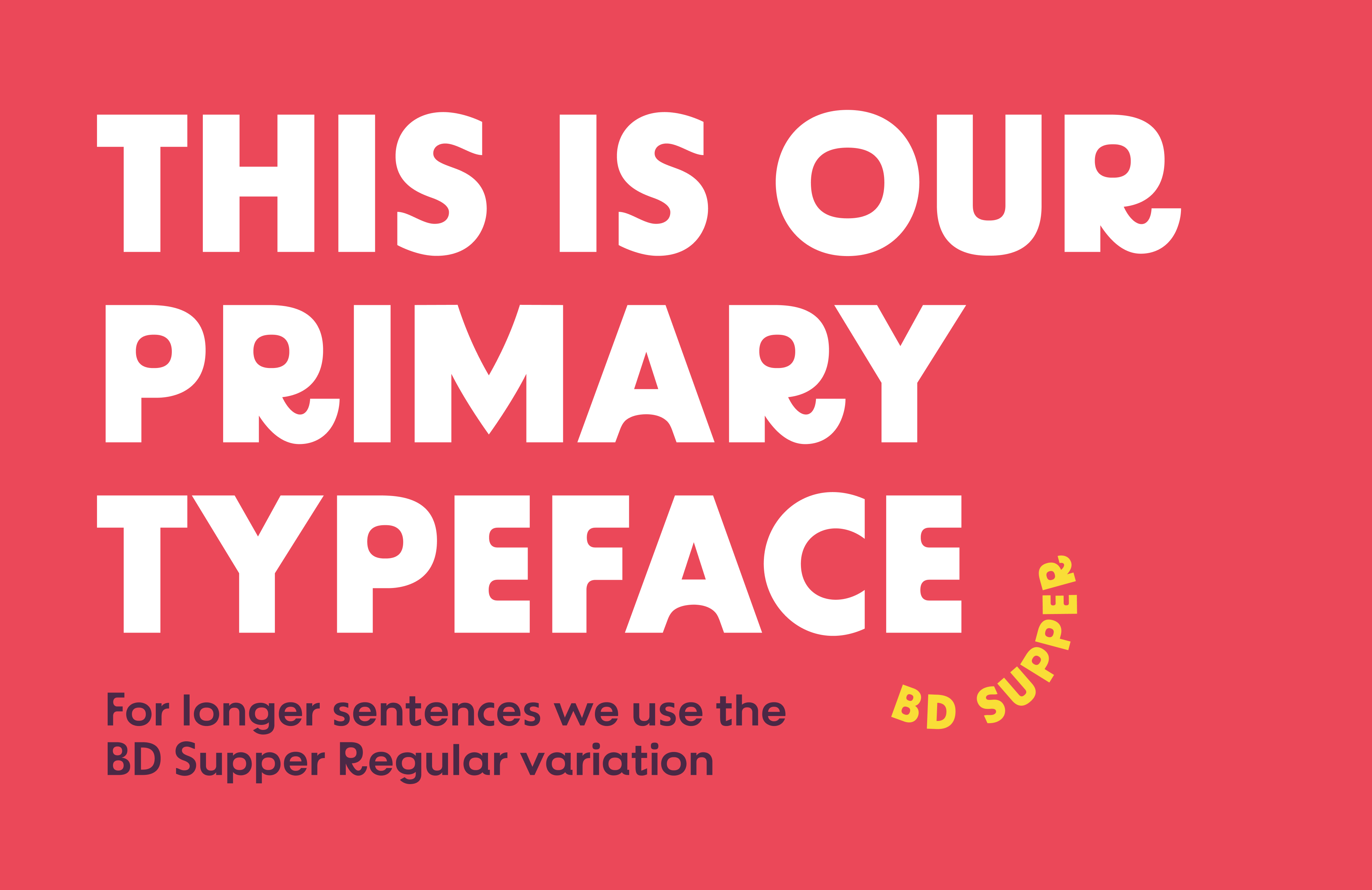
Visually, the challenge was to create something that could jump off the shelf without falling into the generic codes of the category.
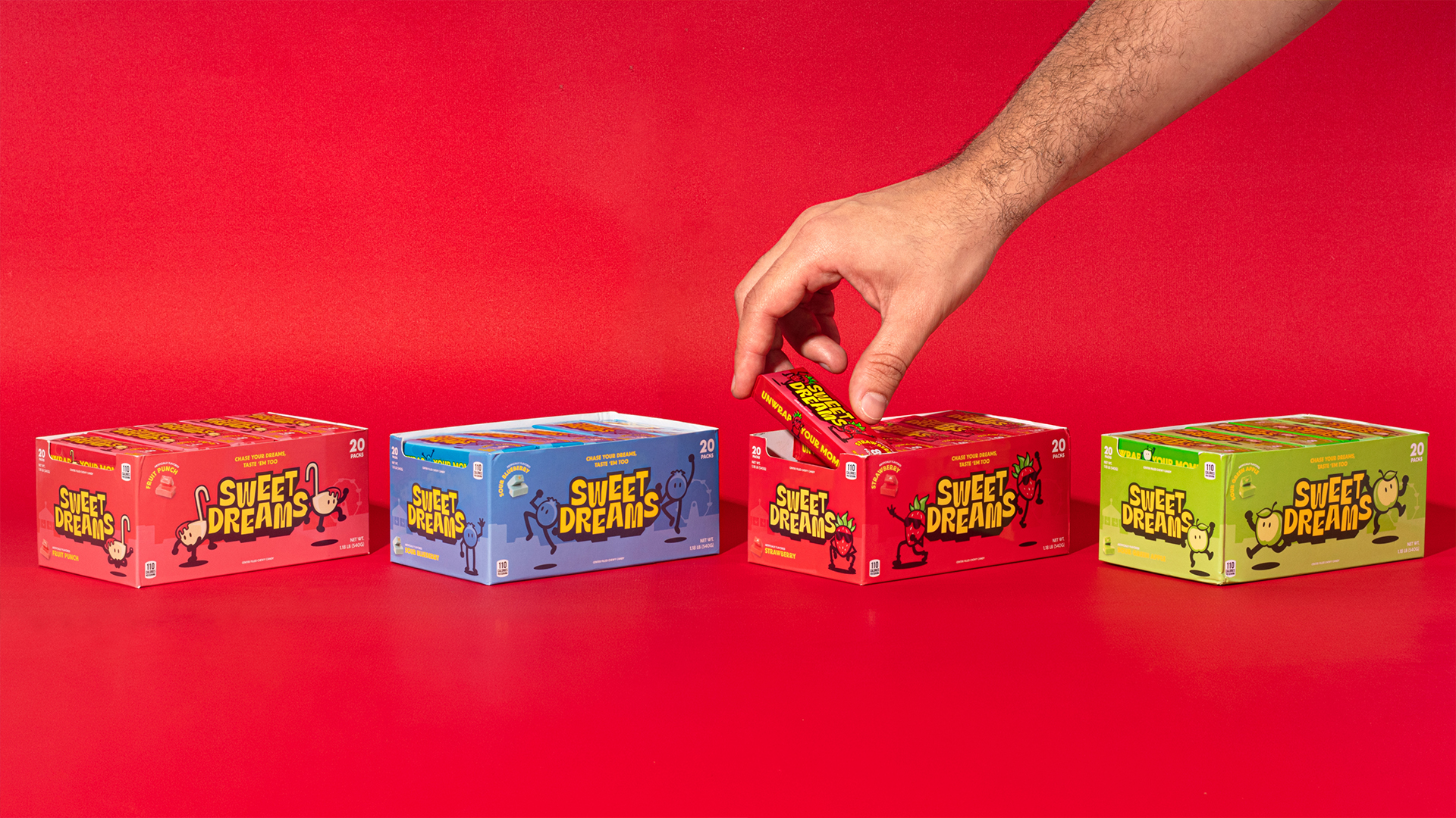
The identity was built around bold flavor colors: vivid red, bright green, bold blue, warm coral. Each flavor was given its own visual presence, making the product line easy to navigate while a vibrant yellow ties the whole world together and acts as the brand's emotional signature. The color of excitement. Of energy. Of a kid spotting something they want from across the store.
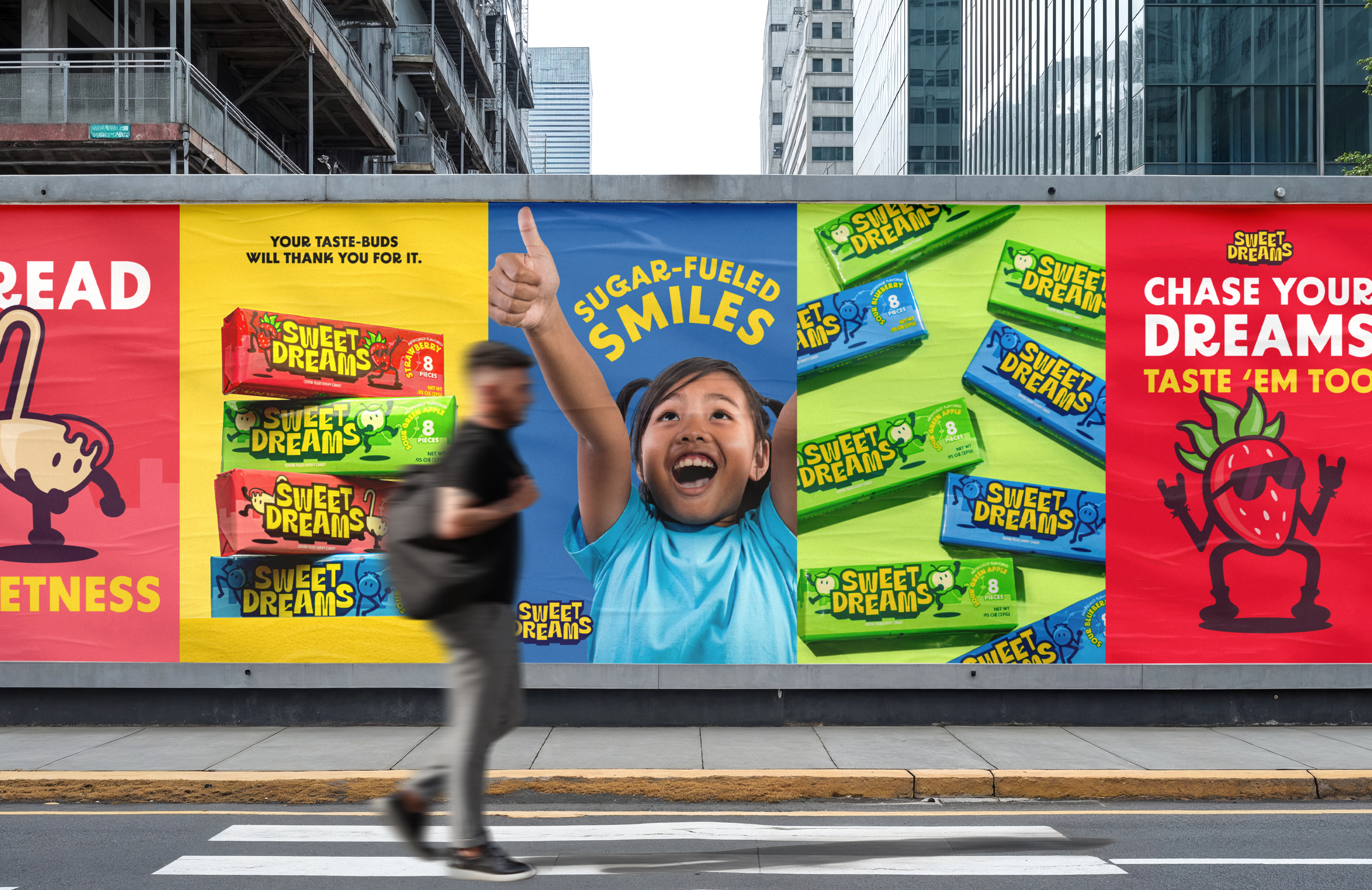
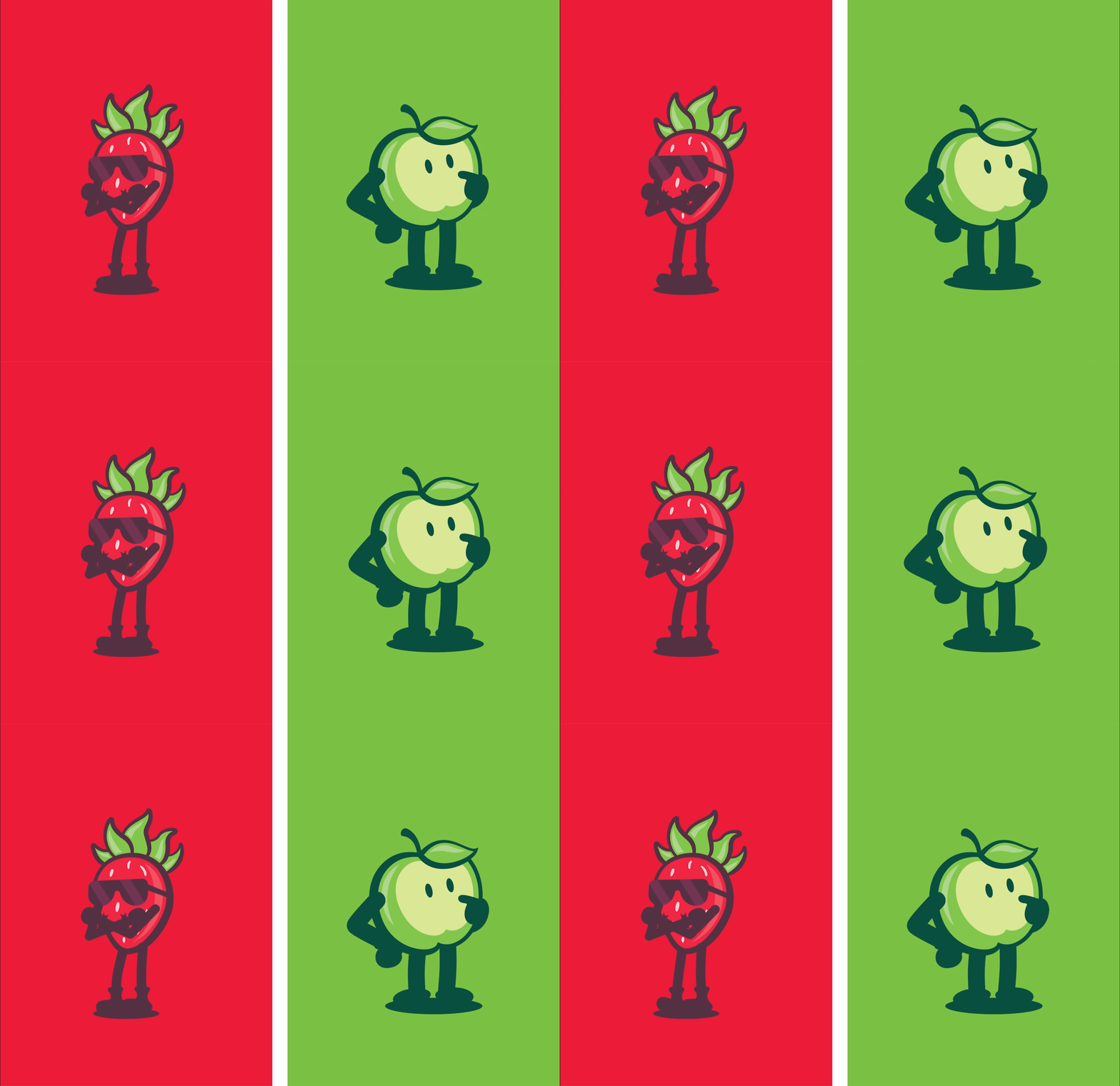
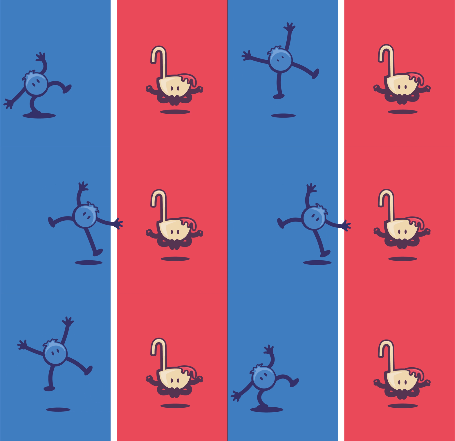
Then came one of the most important parts of the system: the characters.
Instead of treating flavors as simple product names, we gave them personalities. Each fruit character became a small ambassador for its flavor, bringing humor, attitude and expression to the packaging. They created a sense of story around the products and gave kids something to recognize, remember and connect with.
The characters also gave Sweet Dreams a world that could grow over time. They could appear on packaging, social posts, seasonal campaigns, displays, stickers, animations and future product launches. What started as a visual device became a storytelling engine.
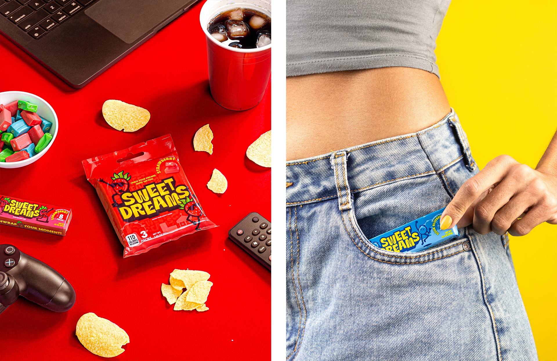
The Shelf Is the First Act
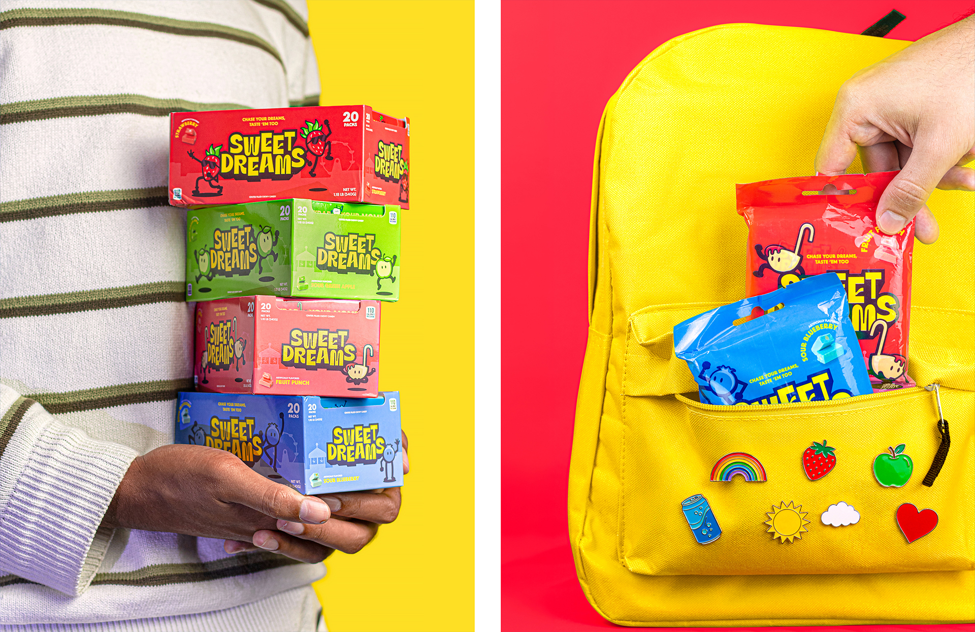
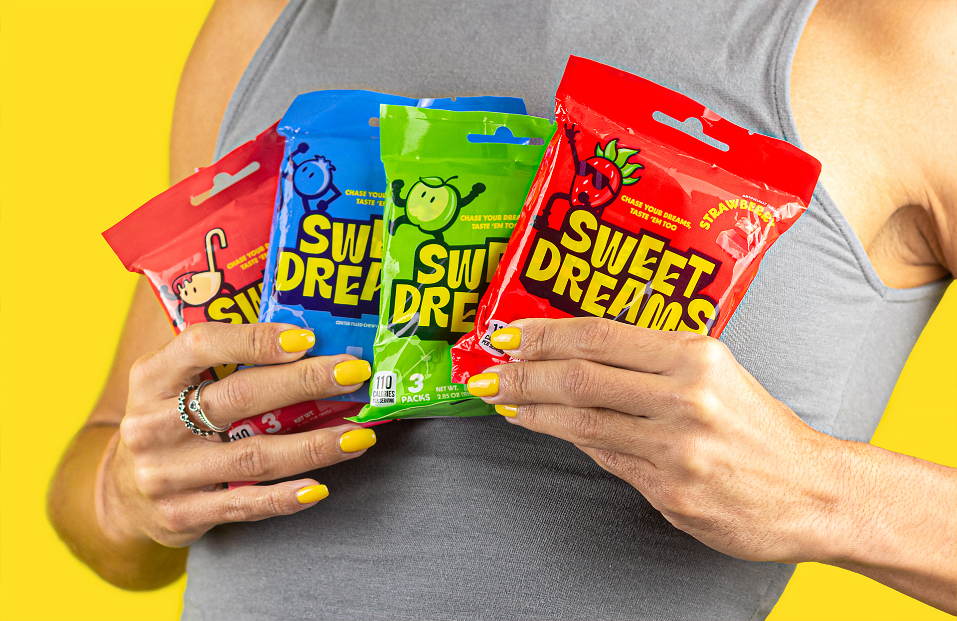
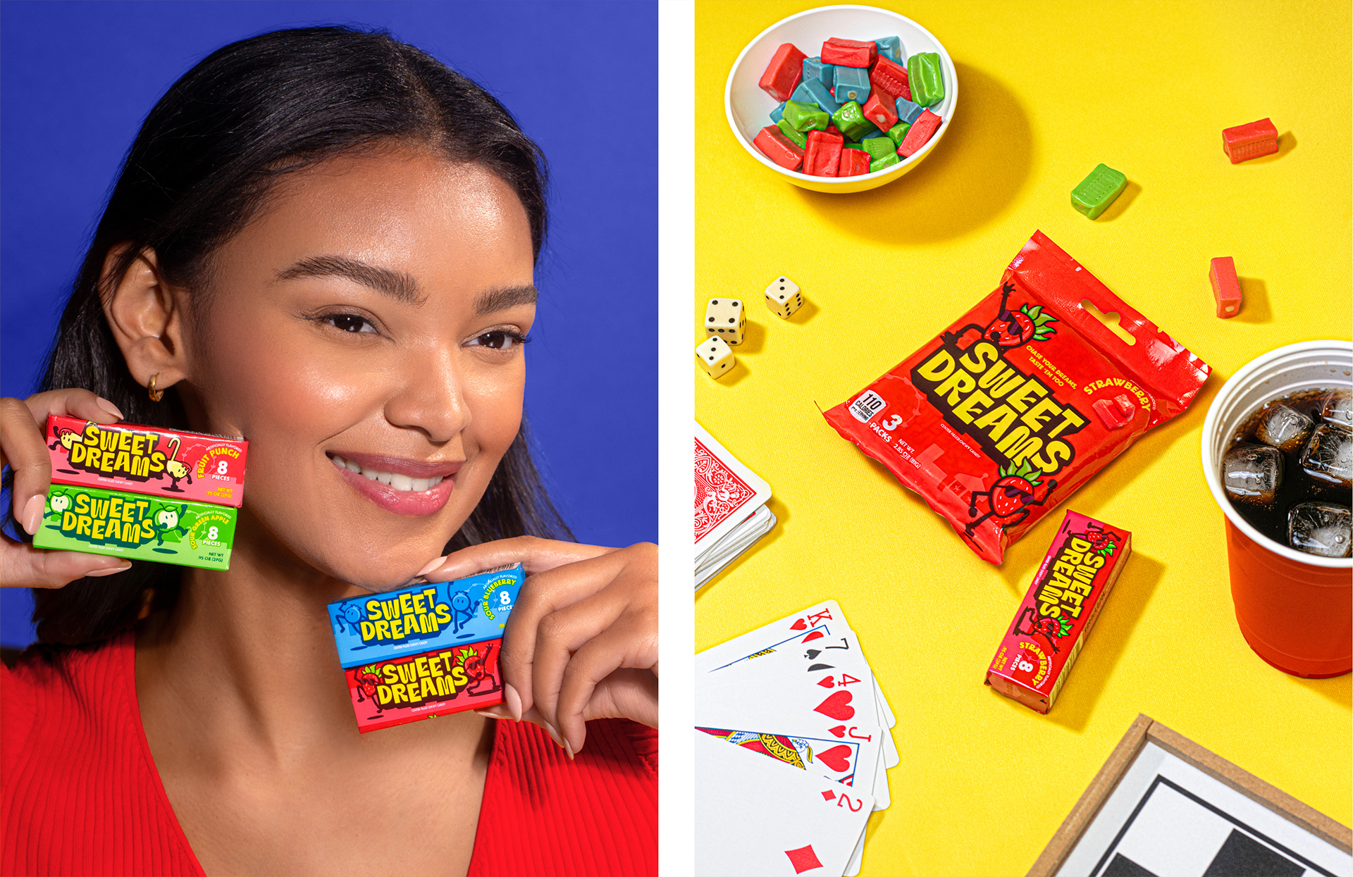
Everything came together in the packaging. For Sweet Dreams, packaging needed to do several things at once. It had to attract kids, reassure parents, communicate value, organize flavors and work across multiple product formats.
We designed a system that could scale from small sticks and inner wrappers to 3-pack bags, 12-pack family bags, 20-pack displays and shipping cartons.
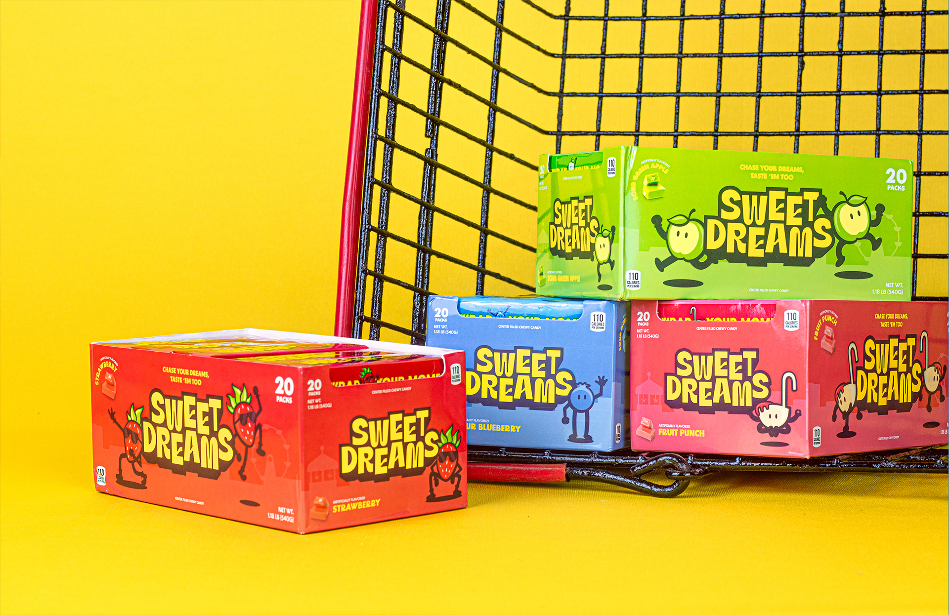
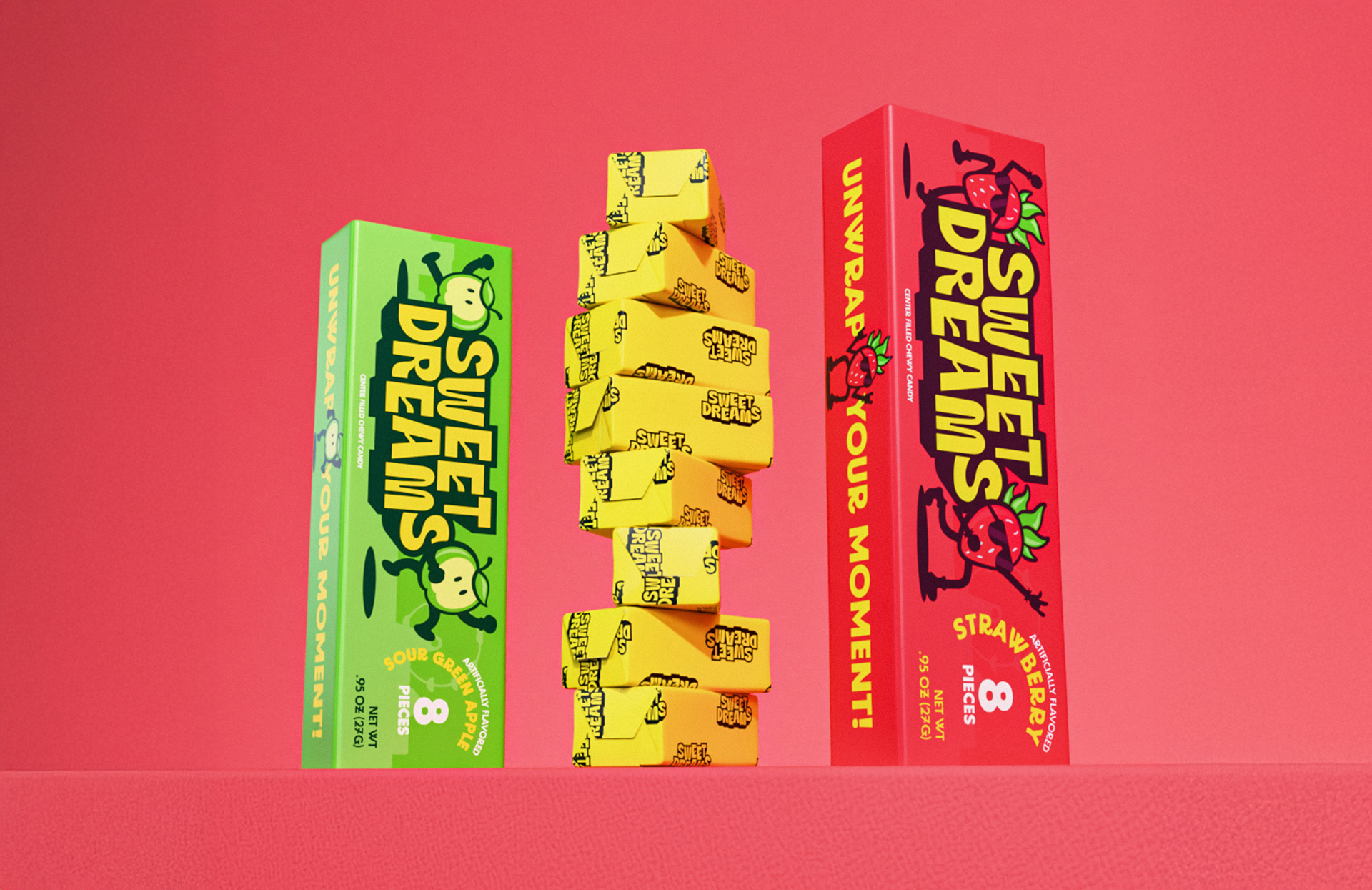
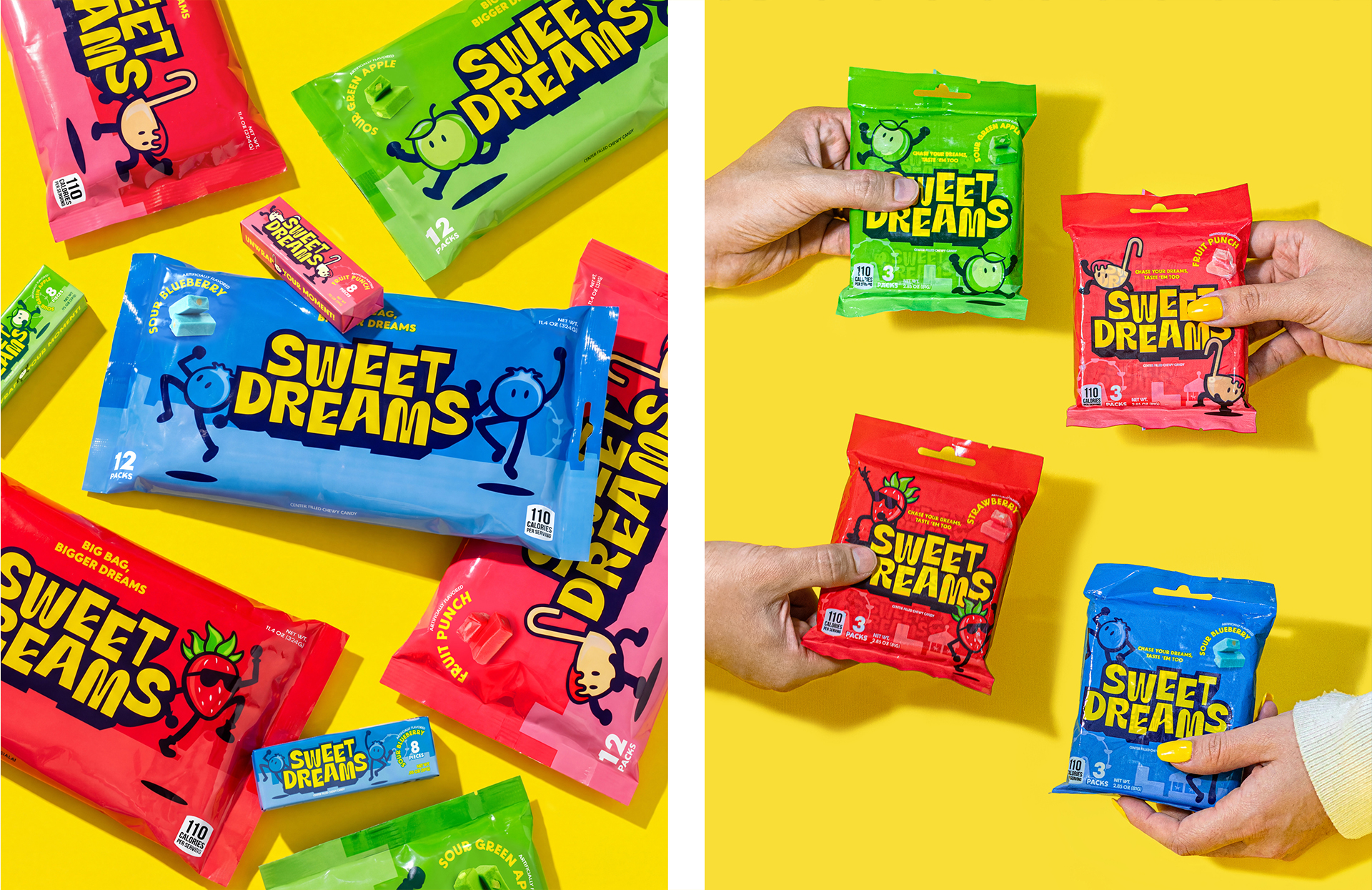
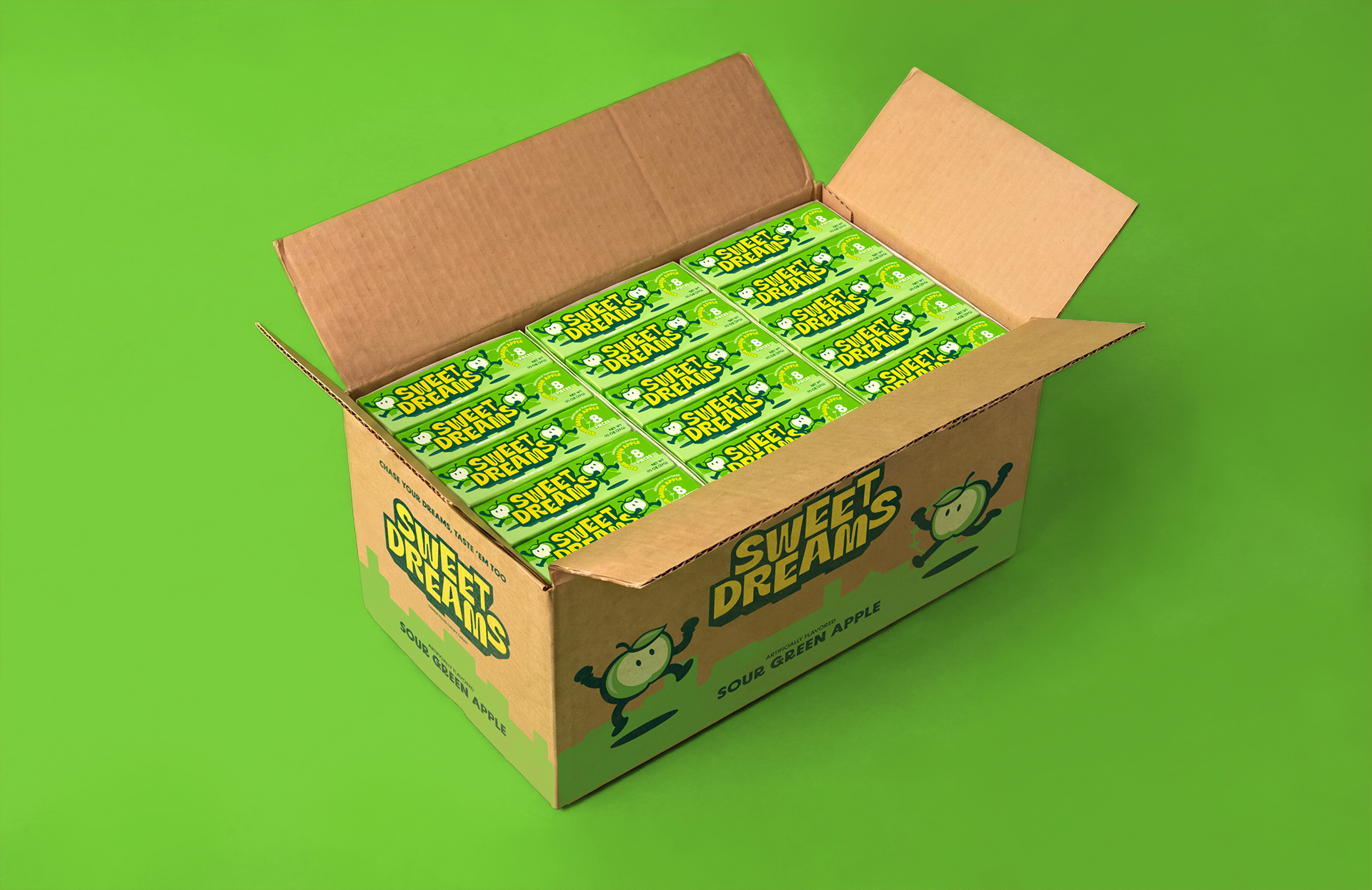
Across all of them, the same logic remained: bold logo, strong flavor recognition, expressive characters, clear information and playful copy. The system was flexible, but never fragmented.
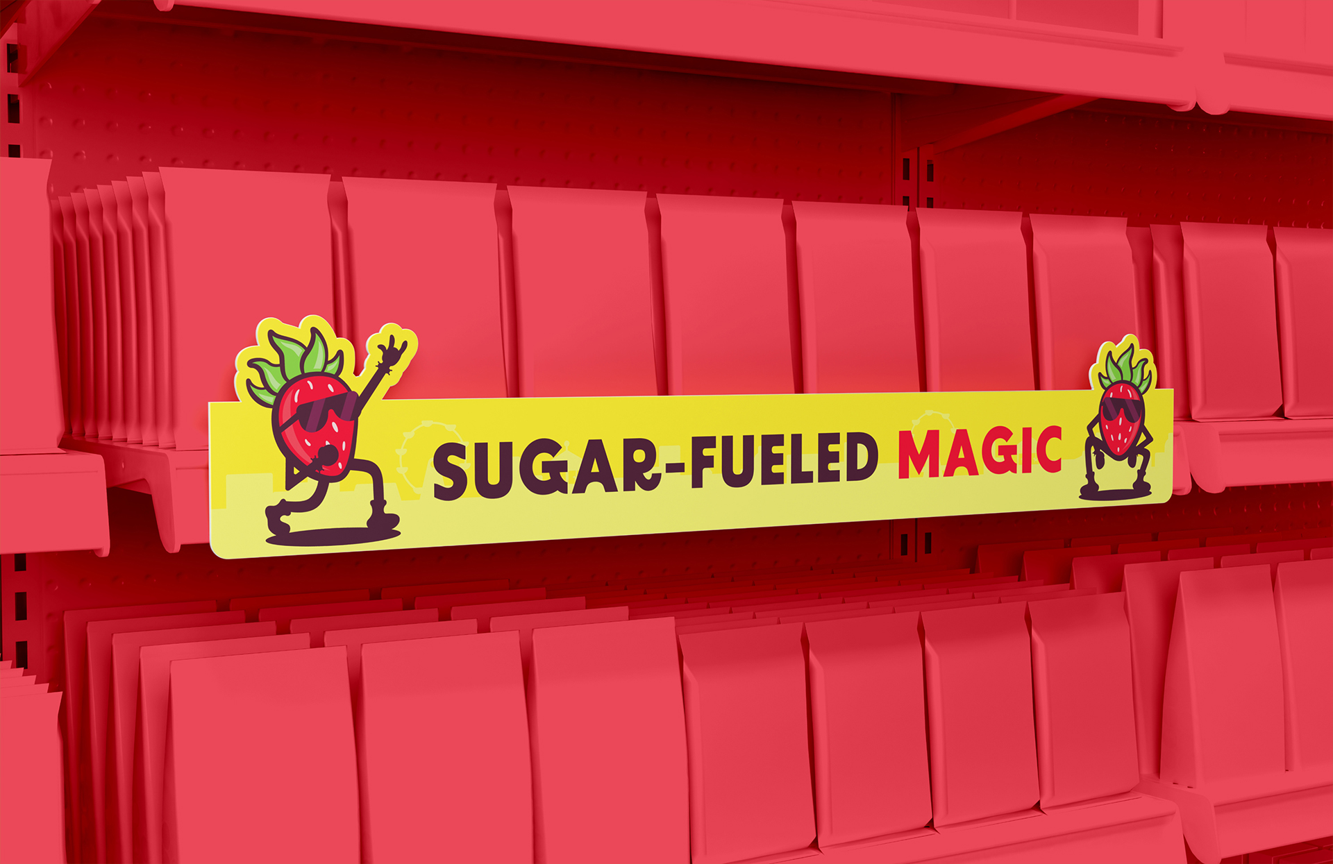
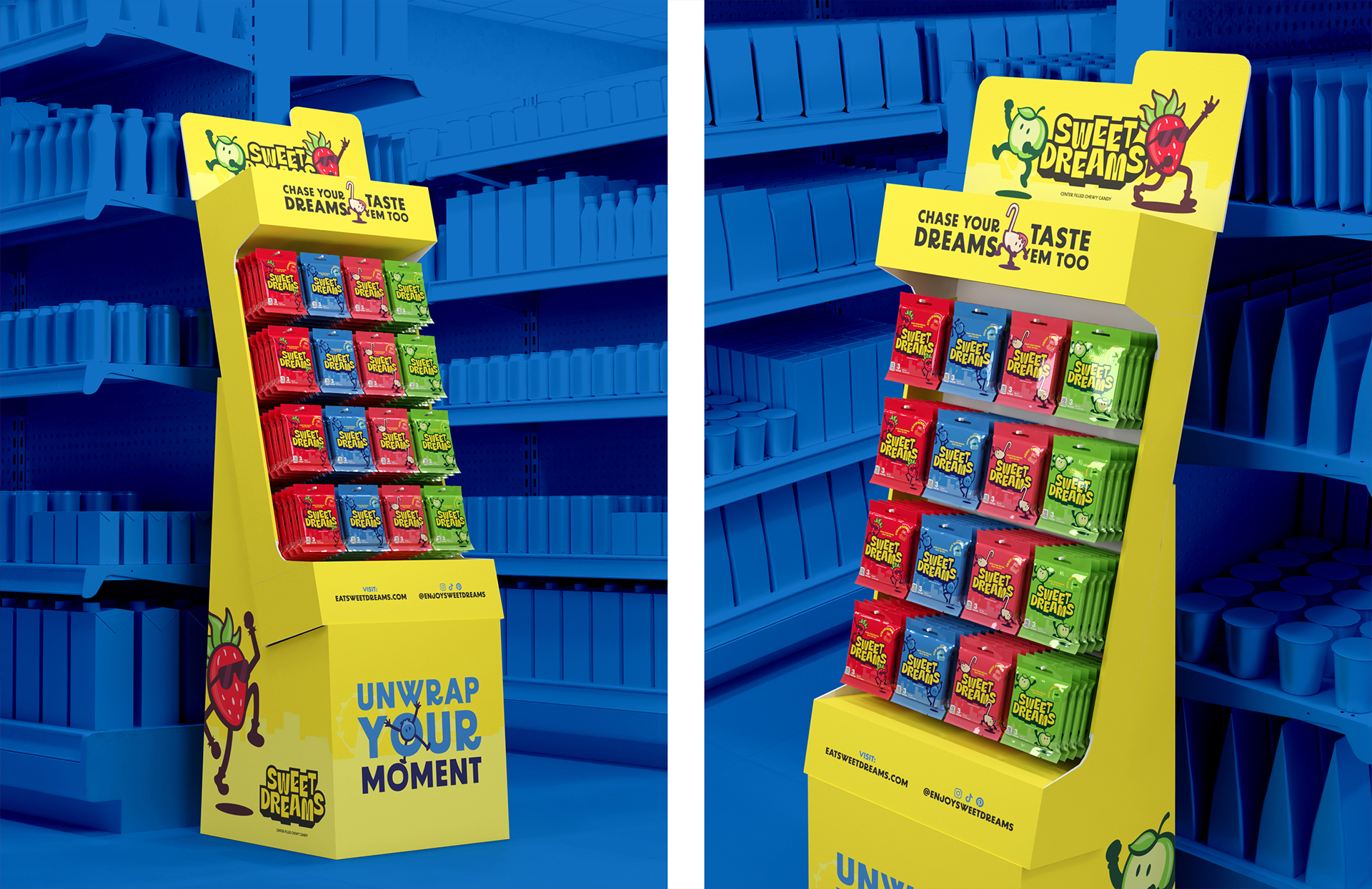
The Dream, Delivered
The candy aisle is a tough neighborhood. But Sweet Dreams arrived with the right attitude: bold enough to be noticed, warm enough to be loved, and sharp enough to know that the best brands don't just sell things, they give people something to feel.